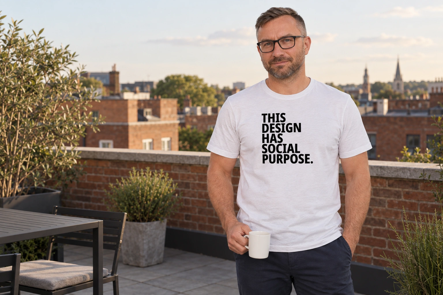
Some sentences sound so official that you immediately want to know where to sign. “This design has social purpose.” is one of them. Five words, a firm full stop, and the feeling that there ought to be an explanatory note somewhere. There isn’t one on the shirt.
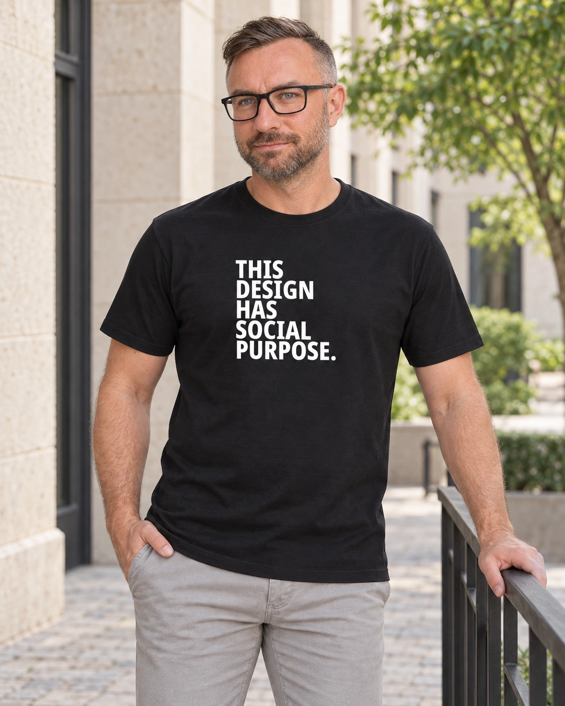
There is just the lettering itself. THIS. DESIGN. HAS. SOCIAL. PURPOSE. Each word on its own line, all in heavy block capitals. The left edge stays straight; the right steps back and forth with the length of the words. The long “PURPOSE.” stretches across the bottom, giving this little structure of text a solid base. Typographically, at least, the purpose is in place.
The sentence does not ask you to believe it. It behaves as though that stage has already been completed. And that is where its joke lies.
An official tone, very little evidence
“Social purpose” is an expression that would fit into a project introduction. You would expect an explanation alongside it: what is being done, for whom, and what will change as a result. This design leaves all those questions hanging. What remains is an opening statement that takes itself completely seriously. The longer you read it, the less clear it becomes whether you are meant to join in with that seriousness.
It is a joke about the need for a grand justification. Even a simple, pleasant thing sometimes seems to demand an intelligent sentence beside it. You could just like an image, but does it actually mean anything? It might mean something, but is that meaning important enough? Here, the design meets the questioner halfway and announces immediately that it has a purpose. It is in no hurry to be more specific.
The word “this” makes it even better. The sentence points to itself. It is not talking about an idea somewhere else, but about the very block of lettering you are looking at. The design justifies its own existence and submits itself as evidence. On an office document, that circle would be a little suspect. On a shirt, it can work rather well.
The black-and-white print keeps your eye inside that circle. There is no illustration beside it telling you how to interpret the sentence, and no small extra line resolving the joke. The large lettering and the full stop take almost all the speaking time for themselves.
The purpose can be quite small
You can find the same openness in the “And So?” story. There, the question goes unanswered. “This Design Has Social Purpose” starts at the other end: the answer seems to be given, but the questions only come afterwards. One asks “and so?”, the other announces that everything is justified. Both leave the reader something to do.
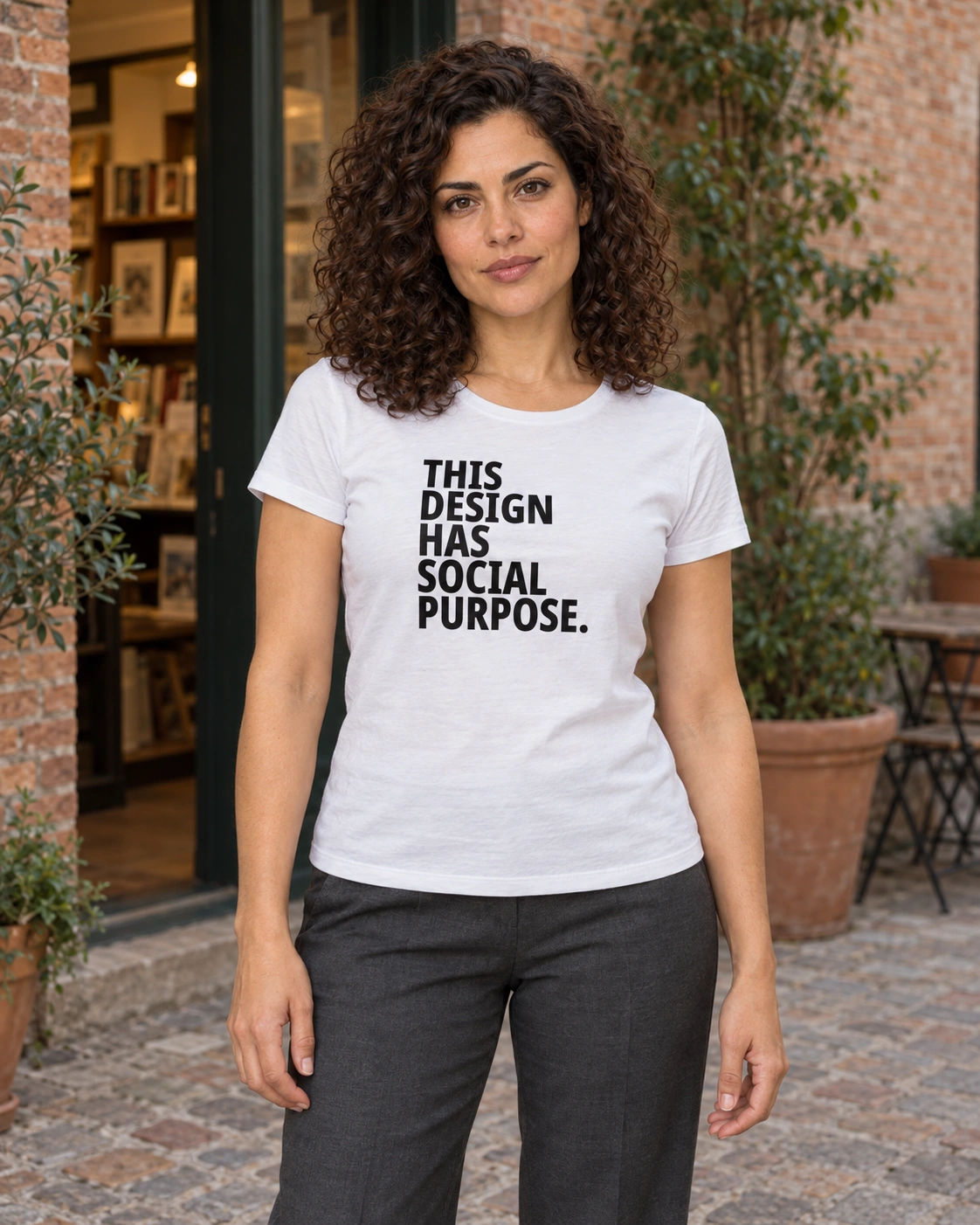
Perhaps this shirt’s most convincing purpose is something quite ordinary. Someone reads the text and smiles at its overly proper tone. You recognise the same joke. A conversation might follow, but there is no need to organise a discussion about design’s role in society. Sometimes it is enough for two people to understand an absurd sentence in the same way.
And if what you like is simply the way those five words sit above one another, that is a perfectly usable reason to wear the shirt too. You do not have to give a presentation on behalf of the entire message. “Not Here to Explain” deals with the question of explaining much more directly; here, a slightly too official answer does the work.
The wearer gets a small opportunity to joke about grand justifications too. Especially if they have also come up with a very respectable explanation for a perfectly simple choice after the fact. There is room for yourself in this joke.
The shirt has a purpose. It has written it down properly. The explanatory note was not submitted.
Anti
(the guy who makes these shirts)
Blacksunset.ee