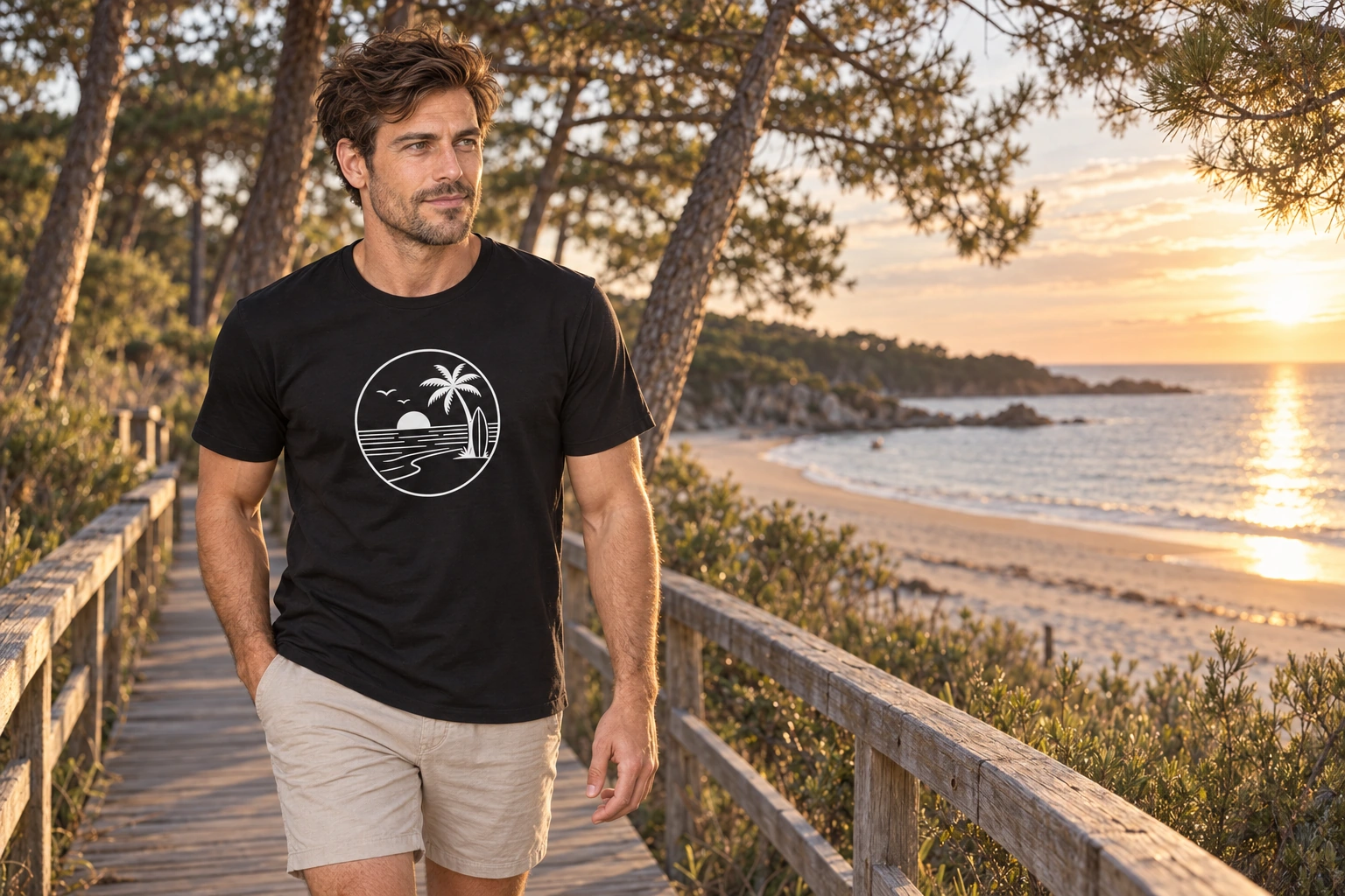
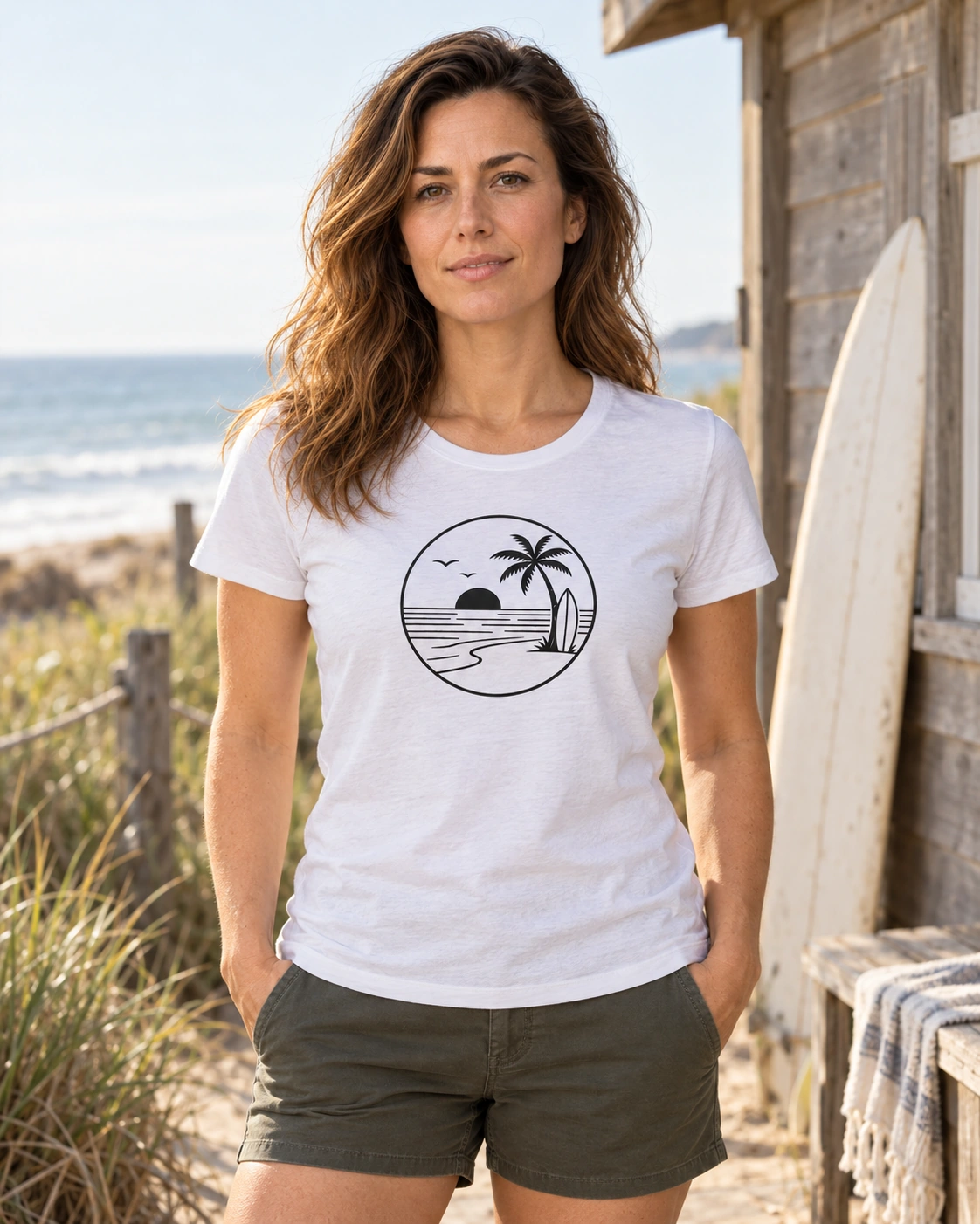
The beach in Sunset Surf Circle has no name. No city, island or coordinates. Two curved birds in the sky, a semicircle of sun on the horizon, a palm and a surfboard beside it. The picture would give a fairly vague answer about its location. It answers immediately when asked what kind of place it is.
That is an interesting ability of a simple illustration. The bird is not particularly thorough anatomically. Two joined curves and it is done. The water consists of horizontal lines interrupted here and there by empty space. Yet you do not have to look for long to know what is happening in the picture. Your eye supplies what is missing.
Marks become a landscape
Separately, these shapes could serve as icons. The palm would stand for a beach, the board for surfing, the sun for good weather or evening. Here, though, they come together in particular places. The board stands beside the palm, the palm trunk grows from the shore, the shore curves towards the water, and the sun touches the horizon. Their relationships turn the marks into a landscape.
Look at the directions for a moment. The water lines run out to the sides. The board stands almost upright. The palm trunk leans, and the shoreline comes into the foreground in a soft curve. That is why the picture is more than a collection of beach-related things. Each detail leads the eye a little differently until they meet in one view.
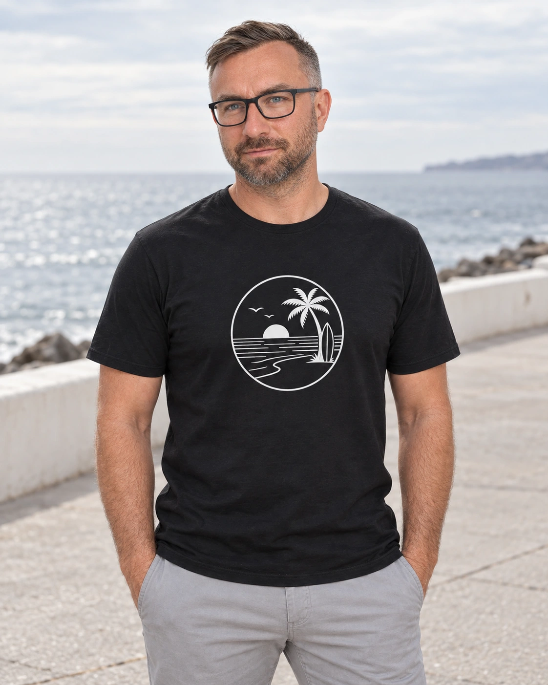
In the Beach Totem story, the beach symbols are separate parts you can consider individually. In Sunset Surf Circle, meaning begins to grow from what lies between them. Water separates the board and the sun. Empty sky sits beside the palm. In the foreground, the beach continues beyond the last line. The distances are as necessary as the objects themselves.
The frame does some work too. The circle gathers the entire scene into one emblem, but the horizon inside turns it into a view. From farther away, you see the whole round image. Closer up, you can follow the shoreline into the water and on towards the sun. The same design allows two viewing distances without continually adding more detail.
Your place may be a little different
A beach picture without a place name leaves one lovely thing open. For one person it might recall a shore they have seen, for another an old poster, and for a third somewhere they would like to go. The picture confirms none of them as correct. Nor does it need a separate version for each of the three.
That is also why you might want a shirt simply for the picture. You do not have to choose a sentence for your chest that you agree with word for word. A design can express a visual preference: you like these shapes, this space, this kind of beach view. That is quite enough. The shirt does not come with a test of your surfing experience.
The One Wave story asks, in its own way, how little it takes to recognise the sea. There are more details here, but the same interest in simplification remains. We recognise the sun from half a circle. The sea needs no blue. The palm leaves convey the shape of the tree without each leaf needing another line inside it.
And in the end, the whole beach fits inside a circle. It is specific enough for the eye to find a path through it, and open enough for someone to form a connection of their own. The palm stays on the right and the sun on the left. The rest can be your beach.
Anti
(the guy who makes these shirts)
Blacksunset.ee