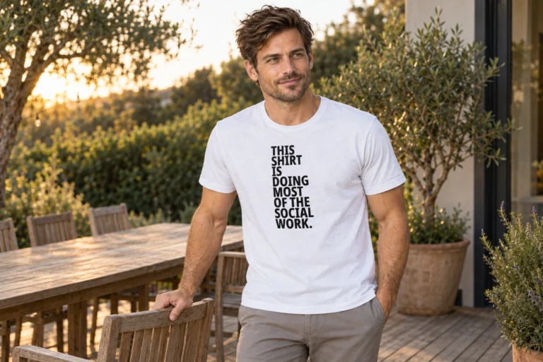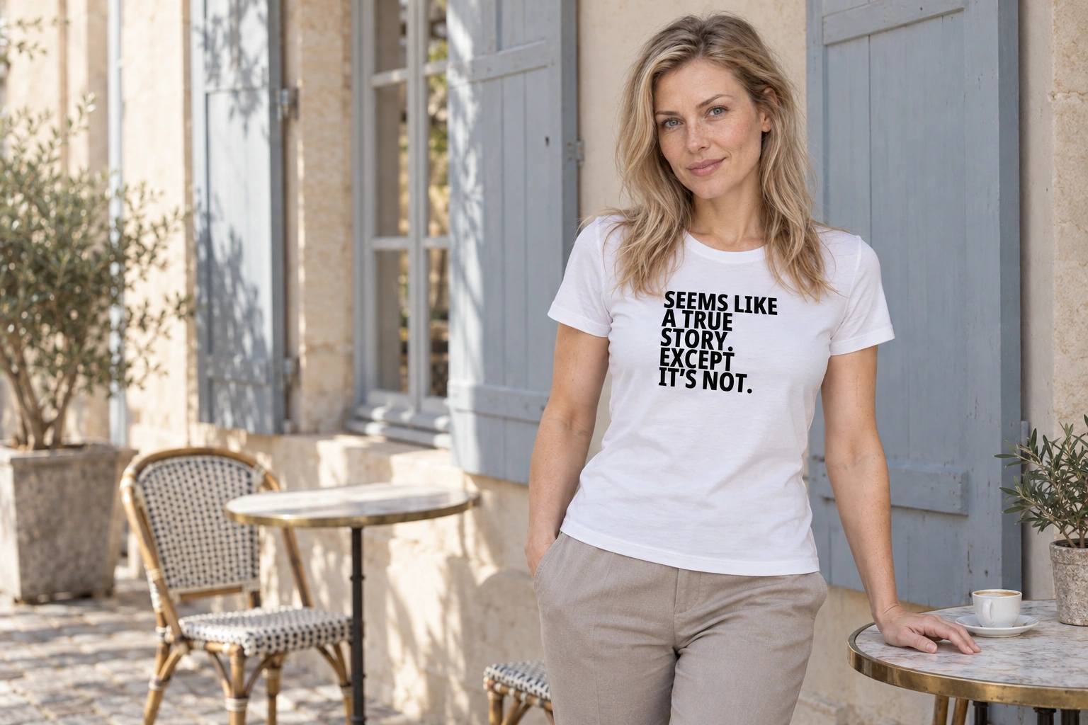
This sentence has a very proper presentation. Large letters, thick strokes, five clear lines. It could be announcing something no longer open to doubt. Read to the end and it turns out the announcement concerned its own unreliability.
“Seems like a true story. Except it’s not.” It appears to be a true account. Only it is not. In the new design, that familiar sentence forms a much heavier block of text. Its name is “Seems Like a True Story. Except It’s Not. 2”, because the first version remains in place too. The message is familiar; the presentation is different.
Five lines, two claims
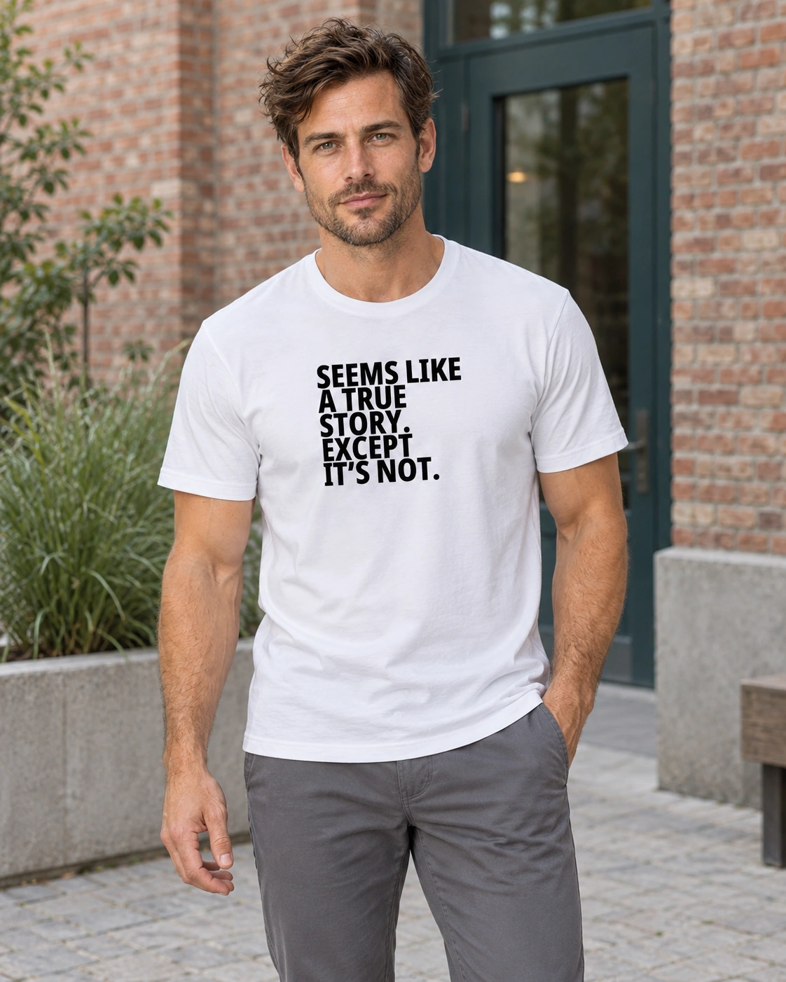
The new lettering moves down in steps: “SEEMS LIKE”, “A TRUE”, “STORY.” Your eye could pause there for a moment. The claim seems complete and the full stop is properly in place. The next line says “EXCEPT”, and the last finishes it: “IT’S NOT.”
The old version’s three spacious lines left more air around the letters and picked out individual words in heavier type. In the new one, the whole sentence is heavy. The retraction too. That is why the last part does not feel like a cautious qualification somewhere at the bottom. The retraction speaks as loudly as the original claim.
A correction often feels like a tiny afterword, but here it has not been hidden anywhere. The design is at least honest about its contradiction. It lets you accept the first thought and then takes it apart right in front of you.
A typeface is not evidence
A sentence in bold has a particular confidence. A heading on a wall, a notice on a door or a very carefully designed presentation can give text weight before anyone has properly read its content. It is a familiar visual device. Here, a joke is built on it.
The shirt does not recount an invented incident. It shows a sentence commenting on its own credibility. You look at a firm form, read a firm opening, and arrive at an equally firm denial. The formatting did its job well. The truth remains unconfirmed for now.
This need not become a call to doubt everything. It is more a reminder that clear language and clear design are qualities of a presentation. You can enjoy them and still ask what lies behind the sentence. Even a very fine full stop is not yet a source reference.
A second reading of the same message
The first blog story talked about a friend whose stories grow larger in the telling. This version suits another angle: how convincingly a sentence can present itself. Nobody has to tell a colourful tale alongside it. The lettering stages the whole little performance on its own.
That is also why the same text in a different design need not feel like the same shirt. Soft But Wild uses the contrast between two lettering styles. Here the joke is precisely that the claim and its rebuttal have almost equally strong rights to speak.
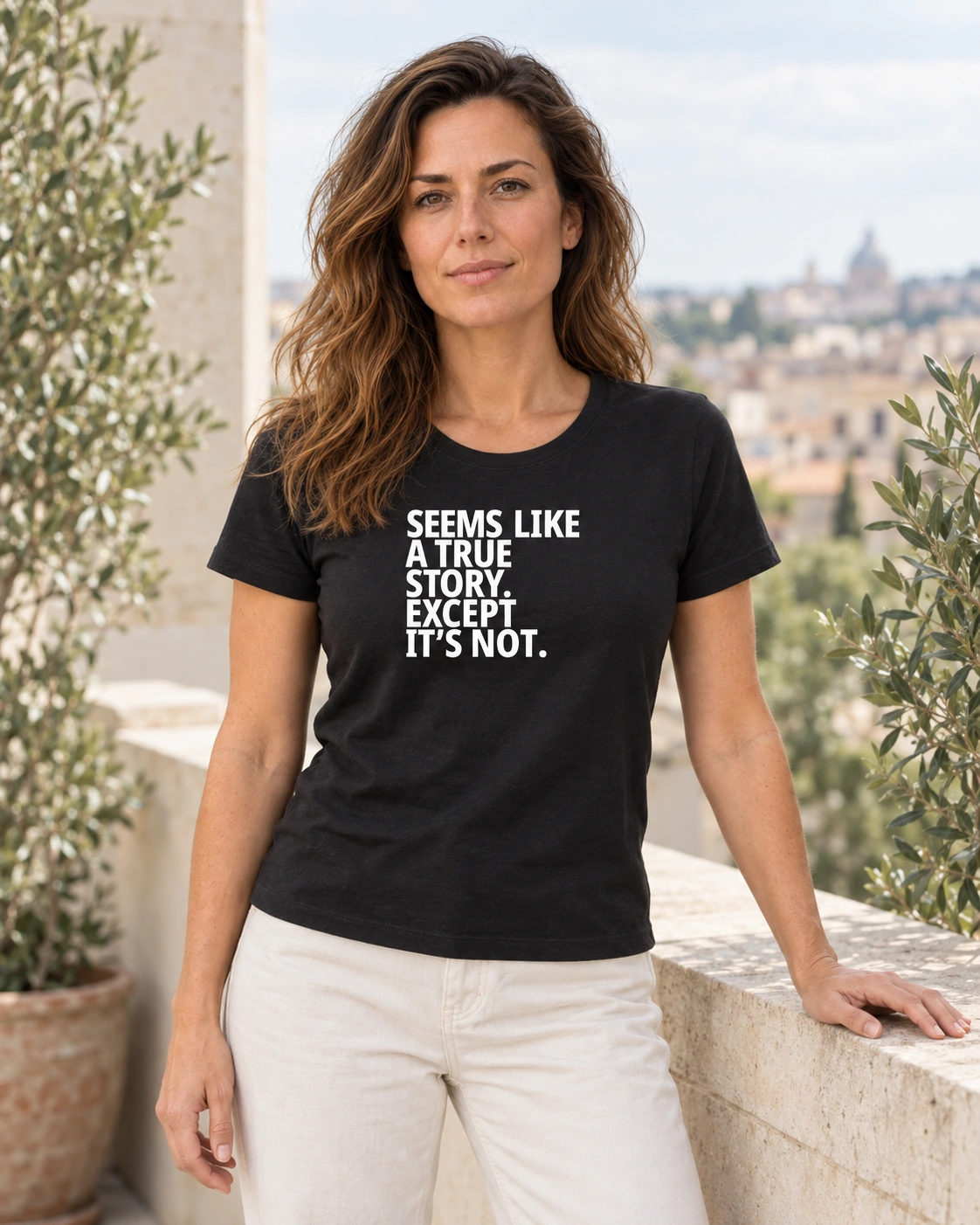
If you like sentences that make fun of themselves, there is plenty to read here. Definite at first glance, a little doubtful on the second reading. You can wear it dryly, without adding much explanation. The shirt has already brought its own correction along.
Five heavy lines. A very convincing presentation. The content received a clarification along the way.
Anti
(the guy who makes these shirts)
Blacksunset.ee
References and links: